
Dana Tanamachi is an important typographer and designer based in New York, she is best known for her
unique
hand lettering and mural artworks using chalk. Her detailed and original lettering style has made her
famous
and an inspirational role model towards countless designers globally.
Dana Tanamachi first came to New York for an internship with good housekeeping magazine as an editorial
designer for 3 months. It turns out she wasn’t as interested in the job as she initially thought. After
the
internship was over, she landed her first job at SpotCo. SpotCo is a creative agency that specializes in
broadway show posters which made Dana take an interest in lettering. In an interview Dana said “it was
the
perfect first job for me.” (Dana Tanamachi. The great discontent. 20 March, 2012). After a year and a
half
at SpotCo she moved to a job at Louise Fili Ltd that specializes the design of restaurants and food
packaging. Her career kick start however started back in 2009, an impromptu installation for a brooklyn
housewarming party she did caught google’s attention which led her to land a commission from google.
This
opportunity skyrocketed her career and reputation as a designer. Her work became globally well known
which
led to her receiving many commissions from well known businesses such as Instagram, Nike, Google, USPS,
and
many others. Named a Young Gun (YG9) by the Art Director’s Club in 2011 and a Young Creative to Watch by
HOW
Magazine. (Jessica Haberkern. Tanamachi Studio.)
Dana Tanamachi’s style is easily recognisable due to its somewhat vintage inspired aesthetic made with
chalk. Her distinctive style became a trend, especially in the 2010s, influencing branding, packaging,
and
interior designs across various industries. Many restaurants, cafés, and retail spaces began
incorporating
hand-drawn chalk lettering into their decor, largely inspired by her work. A somewhat recent work of
hers is
the thank you stamp she designed for USPS.
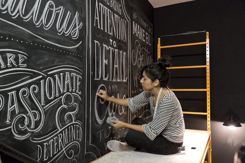
The most significant contribution by Dana Tanamachi to the typography community is reviving and
popularizing hand lettered chalk typography as a trend in 2010s. One of her most significant works was
the chalk mural she did for google’s office back in 2009.
This first started when her and her friends were at a housewarming party, there was a whole chalk wall
filled with scribbles of quotes. She noticed a small blank space on the side and decided to scribble the
word ‘Brooklyn’ on it with her friend, that was the very first time she used chalk that way not knowing
it would change her life. The guests and her friends were mesmerized by the work “I didn’t think
anything of our drawing, but someone came up and asked, “Did you all just do that?” Others started
coming over and asking us to take their picture in front of it.” (Dana Tanamachi. The Great Discontent.
20 March 2012).
The pictures were then posted online and the more people saw her work, the more news of her work spread.
The gigs she received were mostly from mouth to mouth.
“I did installations for all those parties and
everyone would go home and upload their photos to Facebook. I got my first commission from a friend of a
friend who saw the photos online.” (Dana Tanamachi. The Great Discontent. 20 March 2012).
One job led to
another until a friend of a friend offered her to do a chalk mural in Google's new office wing in
Chelsea Market.
Dana Tanamachi’s commission from Google gave her reputation and career a boost and because of this
contribution, her work went viral. This started a significant typography trend and design choice that
lasted almost a whole decade. Her distinct style with murals and chalk ignited a global trend in chalk
lettering and hand drawn typography, influencing designers, businesses, and brands to incorporate
similar styles in their visual identities.
The aesthetic she popularized became somewhat of a template for coffee shops, restaurants, and other
retail stores, especially in the early 2010s. Chalkboard menus and wall murals featuring decorative
lettering inspired by her style became common as a stylish and approachable branding choice. This trend
has also inspired businesses to rebrand their packaging with a more decorative and hand drawn design for
words to fit in the trending aesthetic. Even now, the impact of her contribution that led to this trend
can still be seen in some businesses and typographic choice in general.
Her work has encouraged and inspired many designers and even non designers around the world to explore
hand drawn type, leading to an increase in workshops, courses, and online resources dedicated to
lettering techniques. Social media platforms were flooded with artists sharing their own chalk and other
hand lettering projects such as calligraphy. Calligraphy back in those days were inexplicably popular,
especially among students. They would decorate their notes with calligraphy titles and other ornamental
aspects similar to Dana Tanamachi’s designs. This trend she unexpectedly started basically heavily
defined the 2010s.
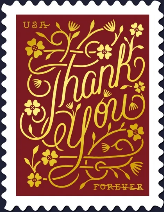
Dana Tanamachi has not designed any official digital typefaces as of now, which is why I will be focusing
on a specific typographically based piece designed by her instead. This USPS forever stamp was designed
by Dana Tanamachi in 2015, however it was not until 2020 that it was officially released.
Dana Tanamachi’s letterings are distinctively detailed with elegant dynamic lettering. This calligraphy
typeface has a significantly large amount of exaggerated swirls at the typeface’s arm, ascender, tail,
stem, and leg. Although it seems crowded with all the swirls and decoration going on, it compliments the
design and also fills in the unnecessary empty spaces creating an elegant harmony. Some of her other
designs that includes calligraphy script have similarly exaggerated lines and swirls to fill in gaps.
The baseline seems to be going diagonally upwards to create a dynamic layout. The leading and kerning
are more on the tighter side as there are barely any empty spaces in the whole design, but enough to
make the design seem cohesive. People who are not used to calligraphy typefaces may not be able to read
it correctly at first because of the somewhat overwhelming swirls, but once they see it they will not be
able to unsee it.
The purpose of this stamp is to show gratitude as shown in the text, which fits the design perfectly.
Gratitude is to be depicted as a positive act and often symbolized with flowers. The calligraphy script
of this typeface is adorned with flower decorations as if the swirls are vines or stems from the flower
which visualizes the feeling of gratitude.
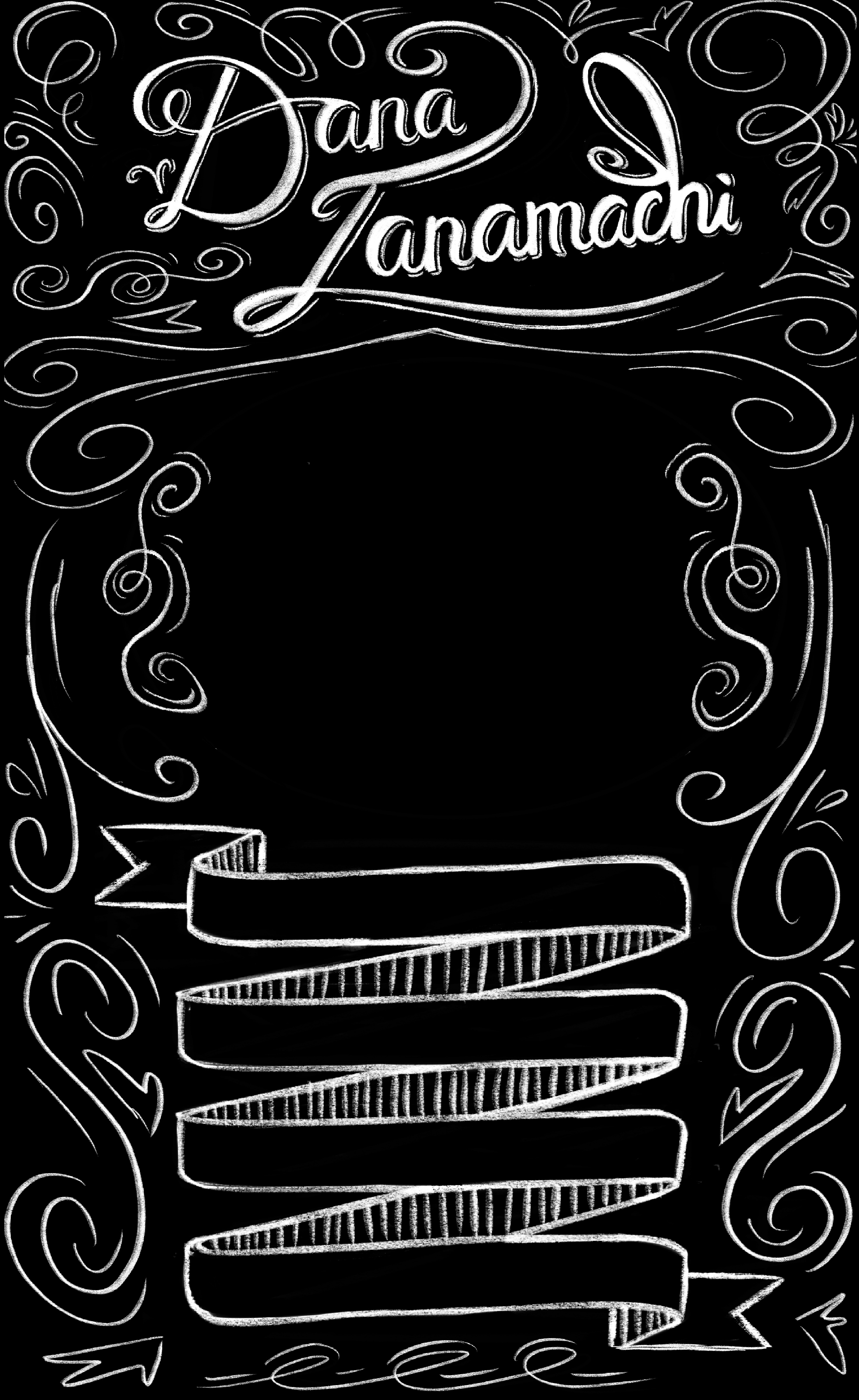
Dana Tanamachi is most certainly not a minimalist when it comes to her designs. Her artworks are known
for its dynamic lettering and the lack of empty spaces that creates a crowded yet cohesive design with
chalk.
Instead of simplicity, her compositions embrace richness and depth, incorporating multiple
typefaces that effortlessly blend into a visually striking, nostalgic, and decorative aesthetic.
Despite the full and hectic design composition, the type hierarchy in her designs are evident and well
balanced. She divides the hierarchy grouping mostly through experimenting with different typefaces and
sizes. All the text are placed in a dynamic way that enables the audience to naturally glide their
attention and read the words by following the flow of the composition.
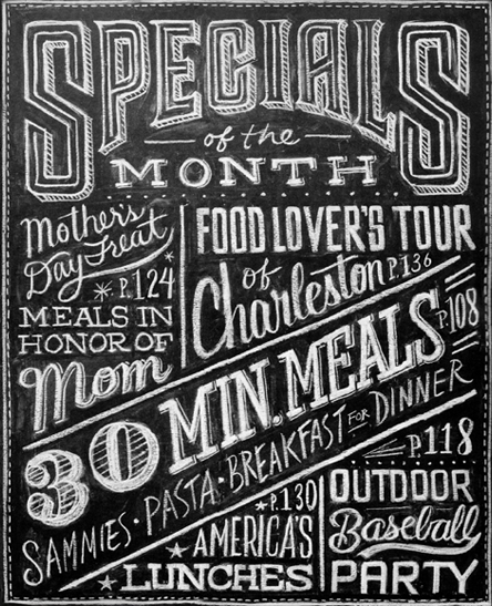 A key characteristic of Dana Tanamachi’s work is her spectacular implementation of type hierarchy, which
allows her complex compositions to remain readable and well balanced despite their density. She
skillfully differentiates between primary, secondary, and tertiary text elements through variations in
size, weight, and typeface. The primary typefaces in her compositions are often the largest and most eye
catching, designed to immediately capture the viewer’s attention. The primary typefaces typically stand
out due to their ornate detailing and is the only different typeface that is used once in the artwork.
The secondary hierarchy, while still prominent, tends to be slightly smaller and bolder than other
typefaces, catching the viewer’s attention naturally through the composition without overpowering the
primary text. Meanwhile, the tertiary text are usually the smallest and thinnest, allowing them to blend
into the background unless the viewer focuses their attention on it.
A key characteristic of Dana Tanamachi’s work is her spectacular implementation of type hierarchy, which
allows her complex compositions to remain readable and well balanced despite their density. She
skillfully differentiates between primary, secondary, and tertiary text elements through variations in
size, weight, and typeface. The primary typefaces in her compositions are often the largest and most eye
catching, designed to immediately capture the viewer’s attention. The primary typefaces typically stand
out due to their ornate detailing and is the only different typeface that is used once in the artwork.
The secondary hierarchy, while still prominent, tends to be slightly smaller and bolder than other
typefaces, catching the viewer’s attention naturally through the composition without overpowering the
primary text. Meanwhile, the tertiary text are usually the smallest and thinnest, allowing them to blend
into the background unless the viewer focuses their attention on it.
Despite the density of her designs as seen on the pictures above, Tanamachi’s strategic placement of
text ensures a smooth visual flow. The viewer’s attention naturally glides across the piece, following
an intuitive reading order that enhances interest and readability. Through this approach, she transforms
dense lettering into an art form that is not only visually appealing but also effective.